 Having just been released in Canada after a month-long stint south of the border, the BlackBerry Torch had been highly anticipated for what it represented — the debut of BlackBerry 6 and a serious attempt at a touch-based handset. The result is not a slam dunk, by any means, but rather a cautious step forward that might signal something bigger to come.
The gist of the Torch is that it is a BlackBerry in the sense that it has the same type of keyboard, along with the trackpad and a 3.2” screen (640×480). Under the hood, it’s using the exact same 624MHz processor RIM introduced wih the Bold 9000 two years ago, a decision that raised eyebrows when Jim Balsillie and co. are unquestionably trying to challenge the iPhone and Android. There is no HD video recording — or playback, for that matter — and the device is still dependent on microSD cards for all the heavy lifting in storage capacity. The Torch only comes with 512MB of internal storage and an included 4GB microSD card. It would’ve been far more interesting if the device had, say, 8GB or 16GB of internal storage, which could be huge for storing many apps and media files.
But unfortunately, the Torch wasn’t outfitted with those things, which leaves much of the old RIM methodology behind the device from the outset.
But that doesn’t overly hinder the Torch in many respects, which is why there’s an upside to it. The capacitive touchscreen is responsive and fairly intuitive in how your fingers can interact with it. It’s not quite at the level that the iPhone is, but it is comparable to many Android phones that we’ve tried. The best move RIM made was not including SurePress, the technology behind the Storm, because there’s really no need for anything like it. The lack of tactile feedback is not a bad thing with the Torch, especially because the trackpad and keyboard offer alternatives for navigation.
What truly makes the Torch unique is the presence of BlackBerry 6. The new operating system has been highly anticipated since the first images of the interface leaked online, and the Torch is the guinea pig to present it to the masses. Many of the most obvious changes are positive steps in the right direction.
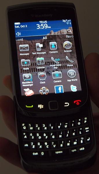
RIM has done away with centralizing every app in one menu, and now offers you a few different ways to get what you want. You can still do it the old way by going to All on the menu at the bottom of the screen, but slide the menu left or right and you will get groups like, Favourites, Frequent, Media and Downloads. Slide your finger up and any apps under those umbrellas will slide up. This also works with feeds from social networks, too, and we’ve already grown to be fans of how it all works. If only RIM could’ve gone further and offered the option to create customized lists (Favourites is pretty much the only one).
 Search has been streamlined so much now that it is truly universal. Slide out the keyboard, start typing and as your query spells out in the search bar, results will pop up underneath. Like Spotlight on the iPhone and Search on Android, you can look for just about anything you want that’s stored inside, like a song, email or document. It works great, and is quick with the results, but it would’ve been better if RIM had dug deeper. As is, the results only display the apps that correlate with your search, plus a number in brackets to indicate exact matches. Sure, you can launch the app from there and get to what you need, but Spotlight does it a little better in that it will pop up a list of file names and small corresponding icons next them. Something with a little bit more depth here would’ve been perfect.
The new OS also led to improvements in the way media and web browsing are handled. The boringly drab design and function of both of these is now a thing of the past. For the first time that we can remember, navigating web pages was a joyous experience that didn’t require endless scrolling. And with music, video and photos, the navigation is also more intuitive, even if it’s not as spectacular as it could be. The difference now is that menus aren’t text-heavy like they used to be.
Moreover, RIM also pre-loaded apps like YouTube, Slacker Radio, Facebook, Twitter and MySpace to get the ball rolling on those fronts. Watching YouTube videos and listening to music on Slacker are enjoyable experiences on the Torch, not least of which because the extra screen real estate makes it a little easier on the eyes.
The camera is somewhat noteworthy for its 5-megapixel sensor and the included LED flash, but it certainly won’t replace a digital camera. Video recording tops out at 480p VGA resolution, so as we mentioned before, no HD recording or playback. This won’t matter as much when played back on the Torch or a computer, but the dated VGA quality shows on a bigger TV.
 Call quality, email and messaging are all superb on the Torch. We found calls were clear and consistent, while setting up email and messaging was a breeze. Furthermore, BlackBerry Messenger gets a bit of a facelift in OS 6, but not as big as we expected. It, too, works as seamlessly as ever on the Torch, and we found it very helpful to respond quickly using the touchscreen keyboard (though its design and layout are a bit clumsy).
The Torch is a solid BlackBerry in many respects, and we have no qualms about upgrading to it, but there isn’t enough of a revolution here. We expected to see some serious innovation, but have instead been treated to a myriad of evolutionary steps, some of which were required over a year ago. Longtime BB users might not be thrilled with the Torch initially, but given some time, even diehards will grow to respect what it can do.
The Torch is currently available in Canada and being carried by Rogers, Bell, Telus, Virgin Mobile and SaskTel.