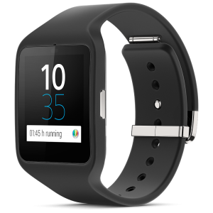
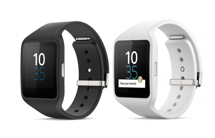
 Sony’s mobile strategy is expected to be more focused and specific in 2015, and though the SmartWatch 3 is a product from last year, it is meant to right some past wrongs and be part of the company’s plans for mobile relevance in a crowded field.
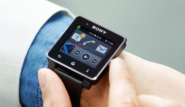
Sony has been at this before. Its first two cracks at a smartwatch were foiled from the start, largely because the software they were running on had too many holes along the way. Android Wear is Google’s attempt to solve the wearable conundrum, and Sony is just the latest manufacturer adopting the operating system offshoot. This means a similar experience to other competing smartwatches, forcing Sony to offer something that is unique and compelling.
Much of that battle has been centred on design. Motorola opened a new salvo in the fight with its rounded Moto 360, prompting LG to remodel its G Watch, too. Given that Wear is still a very new platform that has endless room to grow, the burden falls on Sony to differentiate wherever it can.
Sony preferred to go with a squared design — and eschew the inclusion of a heart rate monitor. The latter is a strange choice, particularly since the band that wraps around the watch’s body comes off without much of a hassle. By its very nature, the SmartWatch 3 is designed to be a health and fitness tool (it’s also IP68 water-resistant), yet it’s missing a key piece of that feature set.
Then there’s the screen. At 1.6-inches and a resolution of 320 x 320, the size and pixel density is typical for a smartwatch like this. The issue is that the TFT LCD used for it is the same as the ones that plagued the company’s Xperia smartphones a while back. They’re no longer used in the company’s phones, which makes their inclusion here just a little puzzling. Basically, the screen doesn’t handle viewing angles well, losing brightness, sharpness and fidelity, but its one advantage is that it’s easier to read in direct sunlight. This is likely the main reason why Sony went with a TFT display rather than something like OLED or IPS.
On the surface, the SmartWatch 3 actually lacks some of Sony’s design panache, but no one will look back at this era when it comes to the beauty of smartwatches. The form factor allowed Sony to include a 420mAh battery inside, which makes it good enough to last for a good two days or more before needing a recharge. That’s not bad at all by today’s standards, and the fact it has a microUSB port built-in is undoubtedly convenient.
Still, the watch’s true longevity begins and ends with the software it’s running on. Android Wear is now at version 5.0.1 to match where the standard Android is. Designed to be intuitive because it’s basically an experience of swiping up, down, left and right. There is a learning curve to that because the interface doesn’t seem to have any rhyme or reason to it initially. On a base level, it’s easy to see notifications pop up. But there isn’t anything like a “home screen” to go back to after swiping down through all the notifications. Dismissing them is as easy as swiping to the right, but there is now the ability to renege on doing so by cancelling within a five-second window — a simple, but very useful feature for getting acclimated with the platform.
It’s possible to “Like” a Facebook post or favourite a tweet straight from the watch, but not all apps can integrate with the watch. Others allow for voice responses, but that’s not overly practical, especially when out in public.
Theater mode is basically a sleep setting for the watch. Swipe down from the main face, swipe sideways and you can turn the feature on. When enabled, notifications don’t show up and the screen goes blank. The only way to go live again is to press the side button. It turns out to be a battery saver in instances where you really don’t need to have the watch doing anything.
There are two hardware components that do help the cause. One is the 4GB of internal storage on the watch itself, making it possible to play tracks directly from the watch to a pair of Bluetooth headphones.
The other is built-in GPS. Apps like RunKeeper and Sony’s Lifelog benefit from this because they can function without being tethered to a phone. The data is just synced over to the corresponding apps on the paired phone. It’s a nice way to utilize a smartphone with a lighter load — and to get pertinent data out of it — but it makes the lack of a heart rate monitor seem reckless. Being able to capture heart rate and location data in one fell swoop without having a phone on hand is what a smartwatch is partly designed to do, so while other smartwatches might be missing one, the SmartWatch 3 is missing the other.
It does help the cause that Sony hasn’t kept the watch within its own walled garden. It can work with any Android smartphone running version 4.3 or later. Being practically waterproof certainly doesn’t hurt, either.
But at $280 and with some tough competition out there, the SmartWatch 3 loses points on its display. The new batch of smartwatches coming to market this year will likely have a better combination of features and styling, so if you feel you can wait, you’re probably better off waiting for this one’s successor.


