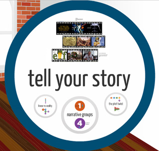
 Presentation software has long been key to visualizing information for audiences, yet its evolution has seemed stunted by a lack of creative options to keep eyeballs engaged. Prezi has tried to change that by infusing animations that go beyond typical transitions and basic slides, but does it work the way it should?
PowerPoint has long been the benchmark for creating a presentation, largely because it’s the most ubiquitous. It’s harder to find a corporate or small business environment that doesn’t use one version of Microsoft Office or another, and with PowerPoint being part of that suite, it’s become the de facto option.
Apple has tried to cut into that space with Keynote, part of the company’s iWork office suite of apps. It’s an impressive visual platform, yet not as widely used, and one reason might be that it doesn’t cross over to Windows PCs like PowerPoint does on Office for Mac.
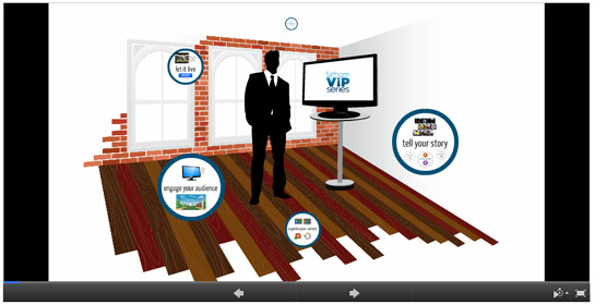
Then there’s Prezi. Agnostic in that it can work through a browser or a desktop app for PCs and Macs, the program is also designed to be non-linear. Instead of sliding from one page to the next, it’s more like a canvas that zooms in and out wherever you map it to go. These “path points” are determined by you, and while Prezi calls the background “3D”, it’s actually 2D imagery with a parallax effect that gives the illusion of depth. If it works for the audience, then it’s done its job, but that will really depend on how engaging the overall presentation is.
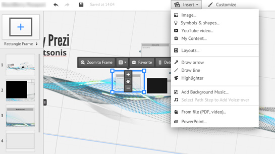
Prezi does help in keeping things interesting because of the layout. There are many templates to choose from, or you can just opt to go with a blank slate and plop in whatever you like, mapping things as you go along. Even with templates, you’re able to move frames around and rearrange the order in which they appear, allowing for a certain degree of creativity in how a presentation or demo will actually run from beginning to end. As good as this is, there may be a tendency to overdo it and have the presentation zigzag between frames, potentially disorienting and confusing people in the audience. I found this to be more pronounced in non-linear cases where I would want to go back to previous slides, but to each their own.
To be fair to its competitors, Prezi isn’t a bevy of choices with transitions, offering the trio of slide, rotate and zoom. They’re nice to use, and still more than the others, but a little more creativity here would be welcome, considering that its one of the cornerstones of the product.
I liked some of the little things at work that helped alter a given template, like changing the shape of the frames, tinkering with theme colours and digging even deeper in the advanced options to fiddle with the background image.
This seemed to complement importing my own files, like photos, graphics and music, as well as videos directly from YouTube. I did have the option of also bringing in my own video clips, which seemed like a fabulous way to add even more personalization to a presentation, though it will matter how big the clips actually are, which I’ll touch on a bit further down.
Prezi would’ve been better suited to offering path points to frames within a frame, rather than forcing users to right-click and add them manually to the sequence on the lefthand side of the interface. A more intuitive approach could’ve been a line tool to draw out the path and then have the frame sequence populate itself to the left. From there, moving the lines or rearranging the frames would be easy if it needed editing.
And as nice as it is to import files, format support could use an update. Vector graphics from Adobe Illustrator can’t be read unless they’re in PDF or SWF, both of which compress the final result. I experimented with JPEG and GIF to see how graphics would turn out in those formats and it wasn’t much different. Even if Prezi offered a bit more on the graphic front, like gradients and embossing, for example, it would be easier to get around some of the restrictions. I suspect this will bother users who want to really spruce up a presentation’s visuals, but it probably won’t vex the average business user or student looking to put something good together. Even better that you’re able to save multiple versions of the same presentation, in case you need to go back to a certain point and rejig things from there.
The video side of things is complicated by the cloud-based nature of Prezi. When using the browser-based version, you basically have to upload that video to Prezi’s servers in order to use it. The only way you wouldn’t need to wait for that process to finish (upload speeds for residential Internet are still terrible) is to use Prezi for Desktop. That ties in directly with the subscription model.
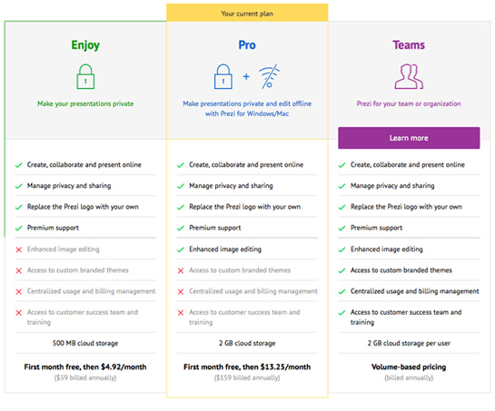
Prezi is free to use on a browser, though you can’t work on it offline and your finished presentation is open for public viewing on the company website. The Enjoy subscription for $60/year ($5/month) makes them private and removes the Prezi watermark, along with 500MB of storage. The Pro plan at $160/year ($13.25/month) includes access to your ‘Prezis’ through the desktop application, plus more options for image editing and 2GB of storage. There is also a Team one that is volume-based on pricing.
Those storage limits are a challenge if you plan on using a lot of video in your presentations. Having a Pro subscription means you can save your work on the desktop version and utilize your computer’s storage space, but with the free version and limited storage in the Enjoy package, you would be forced to temper how much footage you actually use.
Still, I found Prezi a better choice for me compared to the others because I could engineer a presentation in ways that made me take a creative, rather than static approach. That said, it may not be for everyone, and not every presentation made on it may turn out to be great, but at least it’s trying to instill some life in what is otherwise a pretty boring software category.

