 Microsoft faces a real uphill battle in trying to compete with entrenched mobile powerhouses like Apple, Google and RIM, and Windows Phone 7 is likely the last chance for Redmond to have any hope of staying relevant in the smartphone wars. At a gaming event in Toronto yesterday, I got a firsthand demo of the new operating system, and here’s a little of what you can expect.
For starters, Microsoft won’t allow device manufacturers to run roughshod over their OS by allowing them to tinker and tweak it. This also includes strict specs on what the hardware needs to have under the hood, and how it should look on the outside. For a company that once criticized Apple and RIM for being so stringent about the hardware-software combination, this about-face from Microsoft is actually a little refreshing.
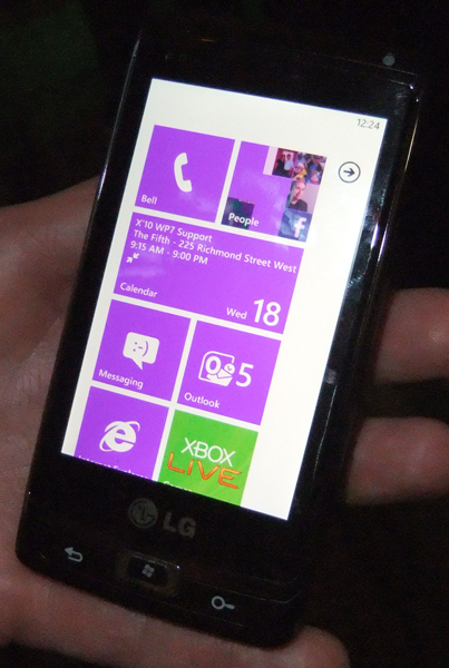
The LG handset used for the demo is purely a mockup, but the simplistic elegance is what Microsoft wants, according to the Microsoft spokesman providing the demo. This means manufacturers like Samsung, LG, Motorola and HTC will surely create only-touchscreen devices, as well as others that have slide-out keyboards. Screen sizes have been set for between 3.5” to 4” with a resolution of 800×480. Needless to say, I found the screen to be crisp and vibrant, so that’s a good sign.
As expected, the interface closely resembles the Zune HD interface, though it’s not a direct ripoff. The main home screen is made up of tiles that offer up the usual list of apps that connect to other services. Standard stuff like email, messaging, contacts and media are plain to see, including direct channels to access Facebook, Twitter and Windows Live. Tiles can be added, removed or rearranged at will, though I’m not sure if there will be a folder system to constrain the top-to-bottom interface design. If not, scrolling could be a bit cumbersome with a lot of apps.
 Viewing messages of all types is easy enough, and typing isn’t bad, either. The predictive text is a bit unusual in that a lineup of potential words appears below the text box, allowing you to drag and drop a word in place of another. The typing mechanics also helped give a better indication of how responsive the screen was, as did scrolling and interacting with tiles. From what I can see so far, it looks quite good.
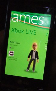
The key element Microsoft is selling with the new OS is integration with services, especially those run by Microsoft. I saw an Office tile, which can best be assumed to be both an app to work on Office documents, but perhaps also a way to work with documents created on Office online. Xbox Live integration is also being highly-touted, especially since gameplay can be affected by actions you undertake on the phone. There may also be the ability to purchase and play downloaded arcade games on the phone, too.
The cross-platform idea isn’t new, as others are already doing it, but at least Microsoft appears to be taking it seriously this time. Windows Live services, and Bing search and mapping are more examples of how the company wants to give way for functionality that leads to greater interactivity on both devices involved. The problem is that it’s hard to measure just how good that is until the final product is ready to launch.
The presence of apps may make or break Windows Phone 7. There were very few that I could see in the demo, and though Microsoft has opened the floodgates for developers already, there’s no telling just how much support there will be from the community. Considering there’s no backwards compatibility with prior Windows Mobile apps, the ground is pretty fertile for new ideas — assuming the incentives are all there.
The lack of multitasking hit some alarm bells for me. Having one app functioning in the background is one thing, but not being able to have a third-party one running in the background could prove to be problematic for those who need that. I have no idea how well Windows Phone 7 will work with a Mac, if at all.
Flash video is already confirmed for Windows Phone 7, which adds a key element missing the iPhone. But it seems that Flash won’t be fully unleashed at launch. Cut, copy and paste are nowhere to be found as well, which might irk some.
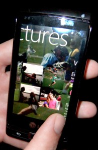
Having said all that, there is promise here. Managing and viewing media seems pretty nifty, and I was always a fan of the Zune interface, save for a couple of annoying aspects. If Microsoft can work out the kinks and offer features that competitors can’t or won’t, then the smartphone race could get a lot more interesting.


nothing can stop microsoft now. I’m definitely buying one.
All the glaring exclusions that won’t be present at launch are coming later, mostly via OTA updates, from what I’ve read. In other words, a year from now, there shouldn’t be anything obvious missing. So, if we focus on what you DO get, MS is squarely back in the game. Granted, I’m a .NET developer, so I do have a slight bias, but that led me to the SDK which is close to what it needs to be to make content generation easy. Once this product reaches a certain market saturation, it will become a powerhouse.