![]()
By Gadjo Cardenas Sevilla
Fascinated by all things Apple, I recently read Revolution In The Valley by Andy Herztfield, which retells the background story of how the Macintosh was born. It featured Susan Kare, whose icons defined the Mac and changed user interface forever.
Icons are everywhere. They’re on your desktop as Live Tiles or icons, they’re on your mobile device featuring the company logo of the app or even a hint of what the app is all about. Icons have been an integral part of the computing experience for the past 30 years. These tiny symbols float on screens as the bridge to a more complex computing experience but just by being there, they need to convey a lot of information about the applications they represent.
![]()
Before the Macintosh, most PCs were command line affairs and required users to type commands in order to enable and open applications. But when Apple drew inspiration from the early work of Xerox PARC (Palo Alto Research Center), they discovered that computers could effectively be controlled with a mouse and this was accompanied with a GUI (graphical user interface) that required icons to quickly represent applications in a visual way.
Susan Kare, was in charge of creating the icons for the user interface of Macintosh. The approach of the entire project was to create a compact, friendly and easy to use computer that anyone could figure out and the user interface was a vital part of that experience.
Kare, a San Francisco-based designer joined the elite Mac team and effectively designed thousands of software icons that have become familiar to anyone who uses a computer. Many of her icons have stayed with the Mac OS (and have been freely ‘adopted’ by other systems) and are considered the genesis of all icons to follow.
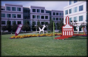
Kare’s Classic Mac OS icons were immortalized in the Apple Campus’ Icon Garden
Designed on a minimalist grid of pixels and constructed with mosaic-like precision, Kare’s icons communicated their functions immediately and memorably.
Many of her icons have become legendary. The Sad Mac, Happy Mac, the Bomb, DogCow, the Watch, the Trash Can and even some of Steve Jobs have become universally recognizable to many Mac users.
After Apple, Kare did work for NeXT Computers, Microsoft (the Notepad icon and various control panels are her creations) and most recently Facebook where she worked on Facebook Gift icons.
Kare also developed various fonts, most important one being the Chicago typeface which was the most prominent font in Classic Mac OS. Her work in the early 80’s is remarkable considering that the graphical limitations of computers back then, yet her icons manage to communicate simply, effectively and in a friendly way.
Kare’s icon of Steve Jobs captures the Apple founder in a good mood
Kare’s pioneering work really put a personality on the Macintosh that made it such an approachable personal computer and much of that work became the template for icon designers and artists to follow.
Icons helped define the Mac’s user-friendly character which endures to this day.
So, every time I look at an icon on my smartphone, tablet or desktop I take some time to really study the thought and effort that went into making it.
More than functional buttons, icons are tiny works of digital art and are still expected to convey ideas, utility and even emotion in one glance.