By Gadjo Cardenas Sevilla
Pebble, the company which kicked off the smartwatch and wearables niche in in 2012, now finds itself coming from behind in a market that’s heavily slanted toward Apple’s Watch and Android Wear.
Pebble doesn’t make smartphones or tablets. The company focuses on one type of product, the smartwatch. During the past three years, it has refined its Pebble, Pebble Steel as well as its Pebble Time smart watches which are considered affordable and practical cross platform solutions for iOS and Android smartphone users.
An idea whose Time has come
Pebble is a great example of an idea whose time has come. The Pebble Time broke all crowd-funding records on Kickstarter by raising $20,338,986 to which is a staggering amount for a second generation product from a company that’s already in business. What’s the big deal about this new smart watch?
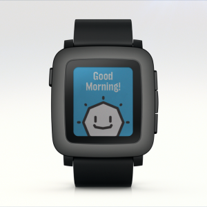
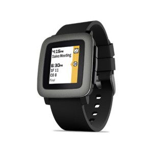
Pebble Time is the first Pebble smart watch to offer a colour display. While the original Pebble managed run for seven days without between charges because they employed thrifty e-Ink technology used in eBook reader, the Pebble Time’s display does feature colour but it is nowhere as vivid or as impressive as what one would see from an LG or Motorola smartwatch and it feels years behind the AMOLED display that the Apple Watch offers.

That’s precisely the point of the Pebble Time. Like a traditional watch, it is always on so you can see the time regardless of the ambient lighting conditions. The new display is clear and easy to read even under blinding daylight, something that most competing devices can’t handle. Too bad that very few apps or watchfaces take advantage of the colour feature.
I find the black and white watchfaces to be much easier to read which sort of nullifies the whole colour feature. I’m still willing to see how Pebble and its apps can really take advantage of this feature.
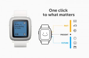
Another improvement over older Pebbles is a new user interface which show users their upcoming and even past events with a button press and also how apps are integrated into the timeline instead of being standalone icons or functions. This makes sense, specially since the Pebble Time does not have a touch display and relies on the four buttons for navigation and control
Cross Platform is key

Pebble Time can be used on both Android devices and iPhones. It is the only serious cross-platform smartwatch in the market right now, at US $199.00, it is also one of the most affordable entries into the smartwatch market.
The things I like about the Pebble Time are that I only need to charge it every five days. It is also quite rugged and water resistant. If my Pebble Time were to be broken, lost or stolen, it would be easy enough to consider replacing. I can’t say the same for a $600 Apple Watch or a $450 Android Wear device.
Pebble Time has a built in microphone. And while you can’t use this to trigger Google Now or Siri like with competing products, I have found it useful for responding to text or WhatsApp Messages using my voice. There’s also the option to send canned responses or even emojis which make it very easy to respond to messages when you can’t really pull out your smartphone.
The Pebble time is ideal if you want a hassle-free adjunct for your smartwatch and don’t need specific health tracking features like a heart rate monitor or GPS.
It is a timepiece with the ability to serve notifications, run a handful of apps, control your music player as well as keep your organized and connected in ways that your smartphone might be too distracting. Whether or not this is worth US $199 to you, really depends on how much you need a wearable device that pretty much replicates many of the features your smartphone already has.


