It’s not surprising that Amazon quietly released its Kindle Voyage eReader in Canada, considering the device launched in the United States 18 months ago. It’s also the most expensive in the company’s lineup with a feature set that isn’t vastly different from the popular, and less expensive, Paperwhite model.
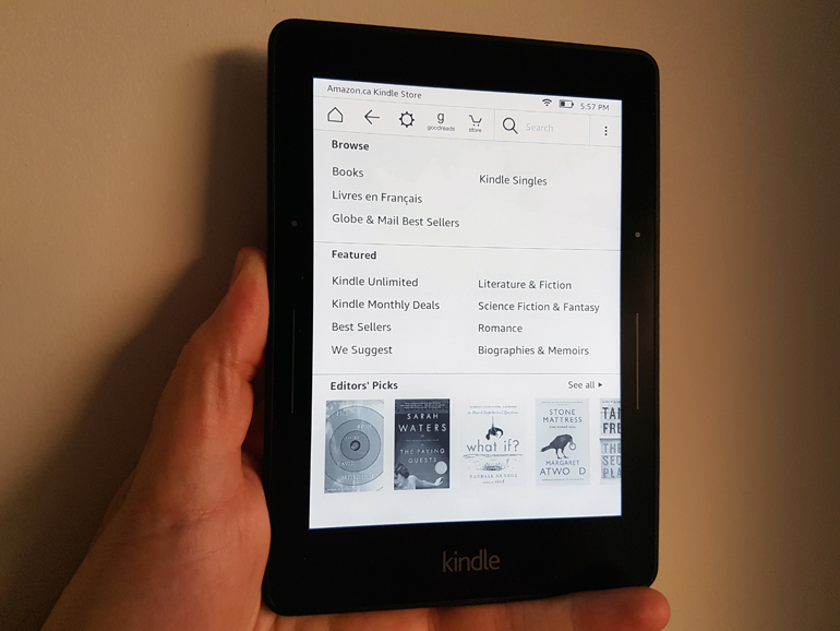
Indeed, the Voyage could be misconstrued as a successor to the Paperwhite, but it’s most certainly not, despite the numerous similarities. The Voyage has a 6-inch high-res display with a pixel density of 300ppi. It is available in both Wi-Fi-only and Wi-Fi + 3G models. The display has a built-in ambient light sensor to adjust brightness on the fly, which the Paperwhite doesn’t do. It is also lighter at 180 grams (Paperwhite Wi-Fi is 205g) and is slightly slimmer, shorter and thinner.
Battery life is about the same, though it takes the Voyage an hour less to charge fully. Content delivery and access is unchanged. The internal storage is also the same at 4GB each.

A key difference lies in handheld operation. Unlike other Kindles, the Voyage can be one-handed in just about every way. Each side bezel has two buttons that Amazon refers to as “PagePress” sensors that are very basic to manage. The longer strip skips forward a page, the dotted one above goes back a page. These are, in fact, buttons and not touch-sensitive controls, meaning you have to press them to activate them. And you know you have because of the haptic feedback, which is unusual, yet welcome, for Kindle eReaders. The feedback is adjustable, allowing for more or less of an effect, depending on preference.
The buttons are mirrors of each other, so they do the same thing on either side of the screen, equalizing usage for both the right and left-handed. The traditional method of tapping the screen to flip a page still works, so nothing has been taken away there. While it might seem odd to have the buttons on the sides, there is a case for the ergonomics involved. I rarely had to hold the Voyage with two hands to keep it stable, and smaller hands would be able to navigate these controls more readily instead of having to contort a thumb to touch the screen.
The power button is on the back, and the microUSB charging port in its familiar spot at the bottom. While a cable is provided, the charging adapter is not, but you can always use a third-party one as an alternative or charge through a computer.
The reading experience is excellent, and though a subjective point, I would argue that the Voyage’s display resonates more. I can’t be sure exactly why. Maybe it’s the ambient light sensor or a perceived sharpness in text, but I thoroughly enjoyed reading on it, and never really felt eye strain, either in bright light or darkness.
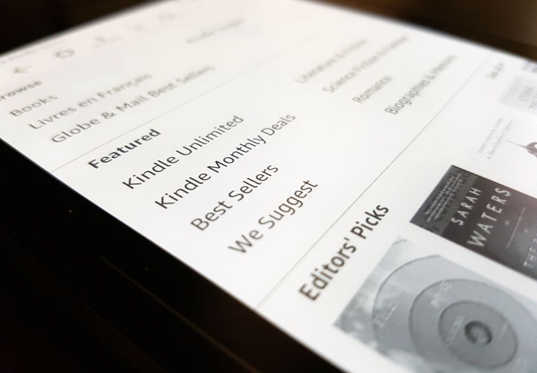
The interface is also going to be familiar, so the Voyage doesn’t offer much that is different in that respect. It’s the same layout, same bookstore and same access.
And that naturally leads to the question of whether it’s worth buying or not. At $300 ($370 for the Wi-Fi + 3G version), it’s considerably more than the Paperwhite, currently available for $120 ($190 for Wi-Fi + 3G).
That’s a big discrepancy, and one that might put the Voyage out of reach for some. Purists will undoubtedly appreciate the device for its overall feel and performance. It may not be a mile ahead of the Paperwhite, but it is a better product, nonetheless. The Paperwhite, on the other hand, is more than serviceable and punches above its weight at its current price. If one-handed operation and ambient light really matter, or you’re not overly impressed with how the Paperwhite screen looks, the Voyage is going to be a step up. If that doesn’t really matter, then you probably don’t need to take that step.


