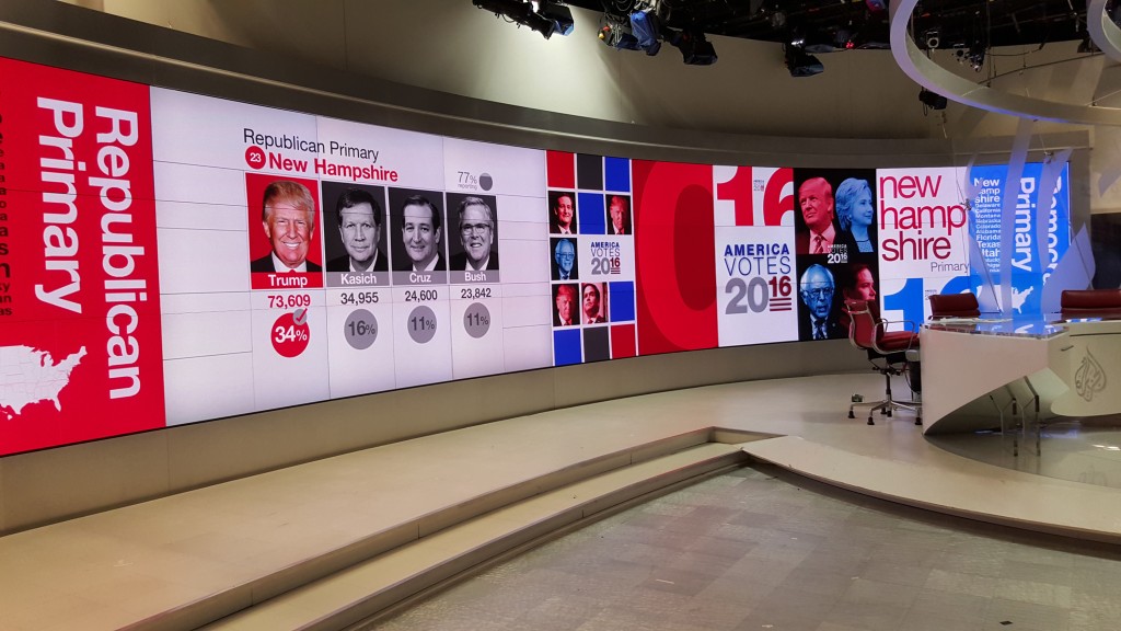
Like rubbernecking in a traffic jam caused by an accident, we just cannot seem to turn away.
It’s the U.S. election. And as important as one may be every four years, this year seems even more influential, and colourful. The 2016 election is drawing much attention and commentary around the world and here in Canada, where the election results will certainly have impact.
We may not have a direct say in the matter, but Canadian technology companies are playing a crucial role in covering and explaining – or at least attempting to explain – the Presidential primary and caucus results.
Companies like Astucemedia out of Montreal and Bannister Lake in Kitchener are among those that manufacture technological solutions for real-time data intake and the visual presentation of such information on-screen, be it a TV, PC or mobile device.

Canadian made digital media and data platforms help broadcast TV stations deliver data-driven live graphics news and election reportage, as well as sports, weather and other live programs.
The digital media and data platforms they are developing are designed to help broadcast TV stations deliver data-driven live graphics for news and election reportage, as well as sports, weather and other live programs.
As well as managing the technological challenges of real-time data ingest, processing and output, these graphic solution designers must also consider analytical, subjective and even emotional implications of visualization.
Both the viewer and in fact the content creator bring to the table a number of preconceptions and expectations about audio-visual presentation, be they social, cognitive, or psychological. Followers of colour theory and practitioners of chomotherapy know the power that different hues and colour saturation alone can have on human perception.
Astucemedia has worked with many broadcasters over the years, and it is providing data integration solutions and graphics implementation services to Al Jazeera America (AJAM) for that media outlet’s live coverage of the 2016 U.S. primaries and caucuses. AJAM uses the solution to capture real-time election data from Associated Press, analyze it, and then present it through clear on-screen graphics which its own TV production team has created for the live coverage.
Company President and CEO Alexander Leclerc described some of the challenges encountered when seeking the right balance between graphic impact and editorial requirement.

Astucemedia is providing data integration and graphics implementation services to Al Jazeera America (AJAM) for that media outlet’s live coverage of the 2016 U.S. primaries and caucuses.
“It’s not only about feeding the data, but having great editorial visual tools” to view incoming data, manage it and use it appropriately to make projections as or if needed.”
Astucemedia has a lot of experience in U.S. elections,” he explained, “and [we are] able to guide what are the minimum requirements and business logic needed for elections. Al Jazeera was able to commit to a clean and defined requirements and stick to what was planned. Most of back-and-forth design aspect was managed by the internal Al Jazeera team and took few months before the integration of the graphics by Astucemedia.”
He noted that graphic templates can be developed “that will be enough to tell the story” but cautioned that having all sorts of templates that may never be used will cost time and money, so careful planning and preparation is needed.
That said, there are always last minute changes, and Leclerc described how the broadcaster’s decision to show or not show the ‘super delegates’ part of the story was one of those decisions. (In the U.S. primaries, so-called super delegates are not elected by primary voters, but chosen by party officials. Super delegates may or may not stick with a candidate throughout the election, so including such information in the tallies before votes are official can be as influential, perhaps prejudicial, as it is insightful.)
That surely holds true with social media content as well, but it too can and does play a role in election reporting.
That’s why visual technology manufacturer Bannister Lake has integrated tools for social media moderation into its graphics platform, known as SuperTicker Flow.

Bannister Lake also gives TV networks the ability to broadcast real-time content and up-to-the-second information for big events like elections, but also weekly sports competitions and daily weather forecasts.
It also gives TV networks the ability to broadcast real-time content and up-to-the-second information for big events like elections, but also weekly sports competitions and daily weather forecasts.
Bannister has also worked with many national and international media clients, and it fully expects TV coverage of the US campaign to intensify in the run up to voting in the November election itself. Being able to integrate broadcast election results and news ticker updates in real-time from a wide variety of data sets is at the heart of SuperTicker Flow development, described D’Arcy Pickering, Bannister Lake’s Worldwide Sales VP.
The data intake requires that companies have sophisticated and specific APIs, or application programming interfaces, that can communicate with various sources using multiple HTTP, FTP or other communication protocols.
The data comes in raw and delivered in JSON format or XML, Leclerc explained, and some programming and logic is applied to make it accessible. Developers create a web-based interface to preview, moderate and configure all of the incoming data feeds. Then, the data is reformatted to be compatible with the processing platform itself and various plug-ins that may also be used. Render engines are then used to process the data as colourful graphic displays and on-screen visuals.
So we are all used to these efficient and effective ways to present numerical data on screen, and the expectation is that we can all ‘read’ line diagrams, pie charts, histograms, bar charts and even something called an ogive curve, a mathematical way of showing event frequency in a visual representation.
Yet researchers say such visualizations, no matter how graphically robust, can still be ambiguous or even misleading (unintentionally, one hopes) simply due to the way data is made so concise. The information that a great graphic contains is condensed out of necessity, for visual acuity and design accessibility, and much more so than it would be condensed for written narrative text.
Even our interpretation of the same visual form can be quite varied, depending on the nature of the observer and on his or her previous experience with data representation, not to mention their favourite colours and other pre-existing expectations or attitudes. All those factors can influence the creator as well as the observer of data visualizations, according to noted political scientist and statistician Edward Tufte, known as a pioneer in the field of data visualization.
As he has demonstrated in several articles and books, the world is filled with misleading, unattractive and confusing visualizations of information. And then, there’s our interpretation of such graphics. Yikes!
Luckily, Tufte provides a number of tips for how to display data for precise, effective, quick analysis.
He covers anything from the design of the high-resolution displays to the data-to-ink ratio that’s employed in creating the graphics to be shown on those displays. He explains how designers must be aware of the balance between design variation (creativity, so to speak) and data variation (uhh, misrepresentation, if you will).

Even our interpretation of the same visual form can be quite varied, depending on the nature of the observer and on his or her previous experience with data representation, not to mention their favourite colours and other pre-existing expectations or attitudes.
Now, no one is saying that misrepresentation is anyone’s intention in the reporting of election results, or on behalf of the candidates themselves.
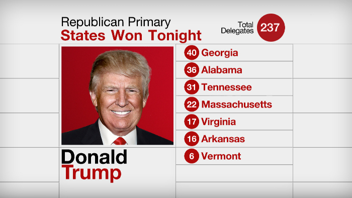
But when one of the election graphics created using Canadian technology showed a uncommon (to this observer’s eye) photo of one particular U.S. Republican candidate, the question arose: ‘Where did you get that picture of a smiling Donald Trump? Everyone seems to have him frowning?’
The Donald has a strong PR and marketing team, according to Astucemedia, and the Trump team suggests which images should be used. AJAM editorial staff picked the final image in a selection process not managed here in Canada.
-30-


